Test Automation Example for Responsive Web Applications using the Galen Framework
It’s hard to imagine a website these days that isn’t responsive, or that doesn’t work properly in any of the most popular browsers. This means that checking a website’s layout against different browser versions, screen resolutions, and operating systems (OS) is a vital task. Doing it all manually would take ages due to the sheer number of variables. Automation of the layout testing process can significantly decrease the time spent on it, while getting the same good result. In this post, we’re going to demonstrate an example of this approach.
The example given is based on our company’s website. Here’s an excerpt from the analytics report, upon which we’ll build the testing process.
| Screen resolution | Number | Share |
|---|---|---|
| 1920x1080 | 87 | 21.1% |
| 1366x768 | 74 | 18.0% |
| 1280x1024 | 66 | 16.0% |
The problem setting
The website consists of five pages and a blog. We’d need to make 100 tests in order to check each pair of browser and operating systems; if we add the three most popular screen resolutions to the mix, it becomes 300 tests. If done manually, this kind of testing is a very monotonous process with an increased risk of missing something in the process. Now imagine what would happen if you needed to deliver your product more than twice a week.
The solution
One of the possible ways to automate website layout testing is to compare screenshots of the page with the “master copy”. The pros here would be the speed and simplicity of setting up and executing the tests. The cons are also significant, however:
- font rendering will vary depending on the engine used by a browser;
- animated parts of a web page will show as rendering errors;
- content on the pages tested always has to be the same as in the master copy.
Another way of testing automation is to use Galen Framework. It’s based on Selenium WebDriver and is built around a page markup language, Galen Specs. The main unit the framework works with is an object; what’s being tested after all is the location of each object on the page and in relation to the other objects.
In other words, we use Galen Specs to describe the position of an element on the page and its interrelations with the other elements. For example, let’s take a menu with a number of equally spaced elements aligned horizontally (we’ll call them element-1, element-2, and so on).

We only need to define their locator in order to describe them:
@objects
element-1 css el1
element-2 css el2
element-3 css el3
Now we need to define their parameters:
element-1:
height ~20px //the element’s height
width ~50px //the element’s width
left-of element-2 10 to 20px //this element is located 10 to 20px to
the left of
element-1:
aligned horizontally all element-2 //this line checks that items are
aligned horizontally by their top and bottom edges
The ‘~’ character means that the indicated dimensions of the element can vary within a 2px range. This helps when testing responsive layouts, elements of which can change their size depending on the screen resolution.
When we need to deal with a number of similar elements, it makes little sense to describe each of them separately. For that, Galen Specs has loops, so we can rewrite the code above like this:
element-*:
height ~20px
width ~50px
@forEach [ element -*] as elementItem, prev as previousElementItem
${ elementItem }:
right-of ${ previousElementItem } 10 to 20px
aligned horizontally all ${ previousElementItem }
Galen Specs has quite a variety of constructs for element description that are easily readable, which makes the process simple and intuitive. In addition to this, Galen Framework offers comprehensive and visually appealing reports of the test results.
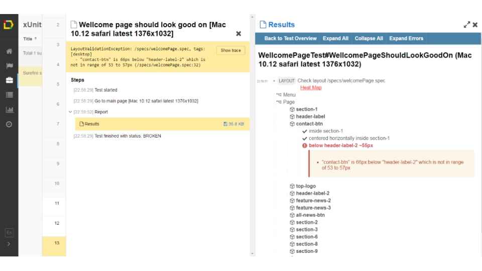
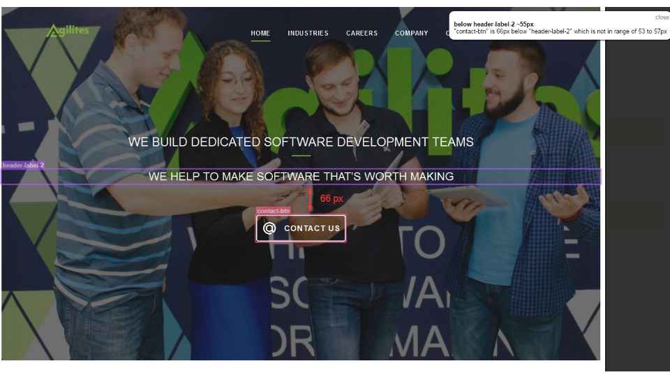
Let’s take an example of an error made in the layout of the front page. In the specification file, we described that the “@ CONTACT US” button has to be located in approximately 55px from the second headline. Here’s how it looks in Galen Specs:
contact-btn:
below header-label-2 ~55px
When run, the test would fail with a visual report showing what’s wrong:
There are a few ways to deploy the testing infrastructure - you can either deploy the testing environment with all the operating systems and browsers installed locally, or use one of the cloud solutions. The most popular ones would be BrowserStack, Sauce Labs, or AWS Device Farm.
Let’s take Sauce Labs as an example. This cloud solution allows you to run tests on more than 700 combinations of browser, operating system, and device. It provides comprehensive infrastructure for manual and automated testing of desktop and mobile apps using Selenium, Appium, and JavaScript.
First, we need to establish connection to a remote server:
WebDriver driver = new RemoteWebDriver(new URL("https://" + USERNAME + ":" + ACCESS_KEY + "@ondemand.saucelabs.com:443/wd/hub"), caps);
Now you can do everything you would normally do with Web Driver. The next step is to define the browsers, OS, and screen resolutions for testing. In Sauce Lab, it can be done by editing a JSON template:
devices =
[{
"os": "Windows 10",
"browser": "firefox",
"browser-version": "latest",
"screenResolution" : "1280x960"
}]
By sending this data as capabilities for the driver, we can perform tests in different infrastructures. Since we used TestNG in the example, let’s pass the test infrastructure data with DataProvider.
@DataProvider(name = "devices", parallel = true)
public Object [][] devices (Method testMethod) throws FileNotFoundException,
JSONException {
String json = new Scanner(new
File("devices.json")).useDelimiter("\\Z").next();
JSONArray browserArray = new JSONArray(json);
Object[][] testDevice = new
Object[browserArray.length()][1];
for (int i =0;i
testDevice[i][0] = new TestDevice(browserJSON.get("browser"),
browserJSON.get("os"),
browserJSON.get("browser-version"),browserJSON.get("screenResolution"),testMethod);
}
return testDevice;
}
In its turn, the TestDevice class would look like this:
public static class TestDevice {
private final String browser;
private final String platform;
private final String version;
private String screenResolution;
private final Method methodName;
public TestDevice(Object browser, Object platform, Object version,
Object screenResolution, Method methodName) {
this.browser = browser.toString();
this.platform = platform.toString();
this.version = version.toString();
this.screenResolution = screenResolution.toString();
this.methodName = methodName;
}
}
Now we can use the data to launch remote browsers, retrieve test results, and get a full report.
The next step would be to create a respective task on the continuous integration server and integrate testing into the development and delivery pipeline. As a result, all layout checks for new versions of the website will be performed way faster than with manual testing, while leaving the test engineer more time for other tasks.
Written by Artyom Anohin